CSS Box Model (Padding, Margin, Border)

In CSS everything is around it box. In CSS box is two types block and inline. Everything is work around these box models. The boxes have two type display Outer Type Display and Inner Type Display.
Outer Type Display:
Outer type display means which property you apply on elemnt that goes apply outer side on element. Outer type display have two boxes one is block box and second one is inline box.
Block Display:
Block display contains whole width of the line and another line is start another new rows.
-Example:
CSS Code:
  <style>
      div {
        background-color: rgb(250, 196, 127);
        width: 95vw;
        height: 50vh;
      }

      .paragraph {
        border: 4px solid black;
        background-color: chartreuse;
      }
    </style>
HTML Code:
<body> <div> <p class="paragraph">Lorem ipsum .</p> <p class="paragraph"> Lorem ipsum dolor sit amet, consectetur adipisicing. </p> </div> </body>Output:
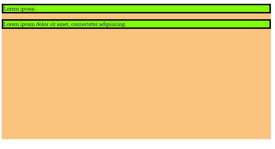
here in this example paragraph is block type element so its contain whole space and the another paragraph will start from new line you can see this, here goes to proof block boxes contain whole width and another will start new row.
Inline Display:
Inline display takes only the equal to content space and another content will start in same line if the space is available in one row. On inline element have no getting changes on horizontal if you apply any property height, margin, padding and border.
Vertically margin, padding and border will apply but not affect any other element.
Horizontally margin, padding and border will apply and also other element get effected these property and move according to the CSS property.
Example:
CSS Code:
    <style>
      div {
        background-color: rgb(250, 196, 127);
        width: 95vw;
        height: 50vh;
      }

      .paragraph {
        border: 4px solid black;
        background-color: chartreuse;
      }
      span {
        border: 5px solid rgb(114, 5, 23);
        height: 100px;
        margin: 60px 20px;
        padding: 30px 20px;
      }
    </style>
HTML Code:
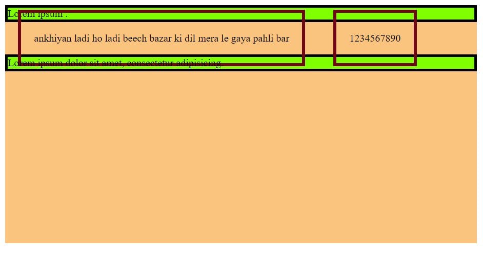
  <body>
    <div>
      <p class="paragraph">Lorem ipsum .</p>
      <span
        >ankhiyan ladi ho ladi beech bazar ki dil mera le gaya pahli bar</span
      >
      <span>1234567890</span>
      <p class="paragraph">
        Lorem ipsum dolor sit amet, consectetur adipisicing.
      </p>
    </div>
  </body>
Inline Type Display:
Inline type display means that those type of child element whose getting affected inner of the container like as display: flex; and display: grid;. These inner type display getting affected container child and all property flex and grid property used on children, so this is the inner type display.
Example of different type display:
Here in example we use many type display values.
CSS Code:
    <style>
      div {
        background-color: rgb(250, 196, 127);
        width: 95vw;
        height: 50vh;
      }

      .paragraph {
        border: 4px solid black;
        background-color: chartreuse;
      }
      span {
        border: 5px solid rgb(114, 5, 23);
        /* height: 100px;
        margin: 60px 20px;
        padding: 30px 20px; */
      }
      .block {
        display: block;
      }

      ul {
        display: flex;

        border: 5px solid rgb(114, 5, 23);
      }
      li {
        margin: 0 20px;
        border: 2px solid rgb(114, 5, 23);
      }
    </style>
HTML Code:
<body> <div> <p class="paragraph">Lorem ipsum .</p> <span class="block">ankhiyan ladi ho </span> <ul> <li>one</li> <li>two</li> <li>three</li> <li>four</li> </ul> <p class="paragraph"> Lorem ipsum dolor sit amet, consectetur adipisicing. <span>1234567890</span> </p> </div> </body>Output:
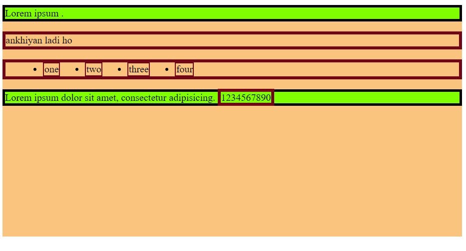
CSS Box Model:
CSS box model is what ever you apply on block boxes and defines the different part of the box - margin, padding, border and content. These are work together and create the box you can see the chrome web developer tools. First write content and then apply on padding and then border and then margin, this is the whole property together called CSS box model.
Parts of Box model:
- Content:
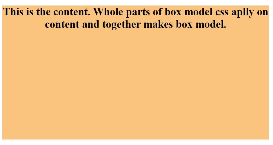
this is the base of the box model every thing apply on content. The box model journey will start from writing content. Content is what ever you write any thing.
    <style>
      div {
        background-color: rgb(250, 196, 127);
        width: 95vw;
        height: 50vh;
        text-align: center;
      }
      p {
        font-size: 30px;
        font-weight: 800;
      }
    </style>
 <body>
    <div>
      <p> This is the content. Whole parts of box model css aplly on content and
        together makes box model.</p>
    </div>
  </body>
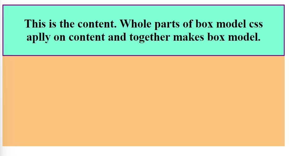
Padding: Padding is means this is providing extra space around content and background is also spread according to the padding values.
Padding is shorthand property it put inside four values
padding-top,padding-bottom,padding-left,padding-right.
    <style>
      div {
        background-color: rgb(250, 196, 127);
        width: 95vw;
        height: 50vh;
        text-align: center;
      }
      p {
        border: 3px solid rgb(134, 6, 145);
        font-size: 30px;
        font-weight: 800;
        background-color: aquamarine;

        padding: 30px 50px;
      }
    </style>
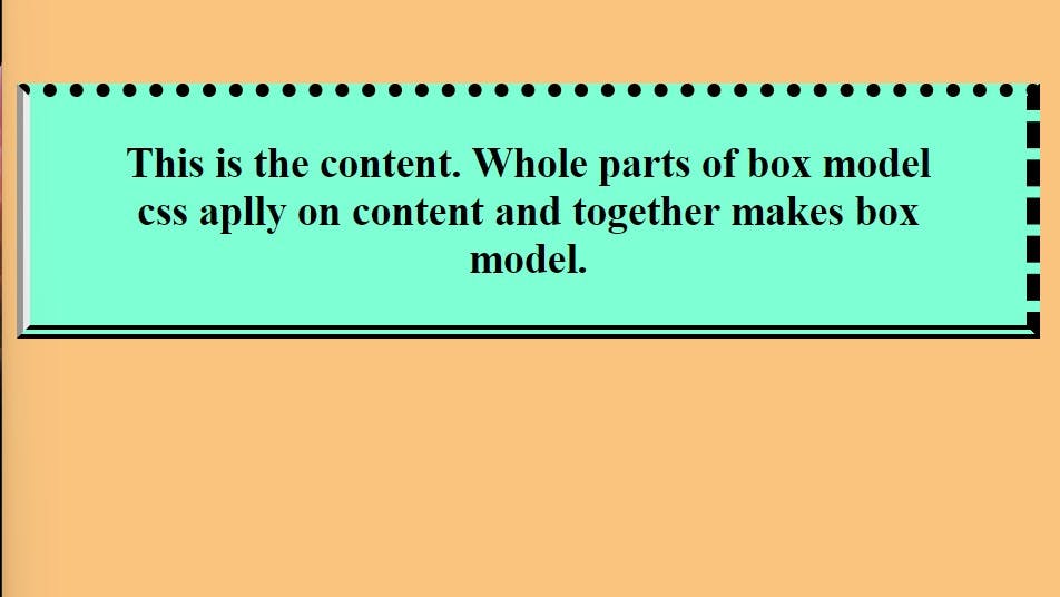
- Border: Border apply upon padding, first content then padding and then border goes to apply. Border also have put four value top, bottom, left and right border.
    <style>
      div {
        background-color: rgb(250, 196, 127);
        width: 95vw;
        height: 50vh;
        text-align: center;
      }
   p {
        border-top: 10px dotted;
        border-bottom: 10px double;
        border-left: 10px groove;
        border-right: 10px dashed;
        font-size: 30px;
        font-weight: 800;
        background-color: aquamarine;

        padding: 30px 50px;
      }
    </style>
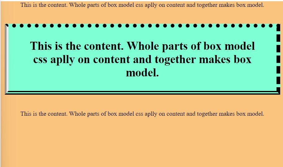
Margin: Margin is providing space around another content. This is the sit upon border and make some space to another content and this is not spreading to content background. Margin have also four type values
margin-top,margin-bottom,margin-left,margin-right.<style> div { background-color: rgb(250, 196, 127); width: 95vw; height: 50vh; text-align: center; } div > p:nth-child(2) { border-top: 10px dotted; border-bottom: 10px double; border-left: 10px groove; border-right: 10px dashed; padding: 30px 50px; margin: 40px 10px; font-size: 30px; font-weight: 800; background-color: aquamarine; } </style><div> <p> This is the content. Whole parts of box model css aplly on content and together makes box model. </p> <p> This is the content. Whole parts of box model css aplly on content and together makes box model. </p> <p> This is the content. Whole parts of box model css aplly on content and together makes box model. </p> </div> </body>
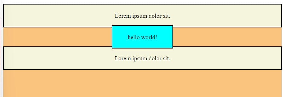
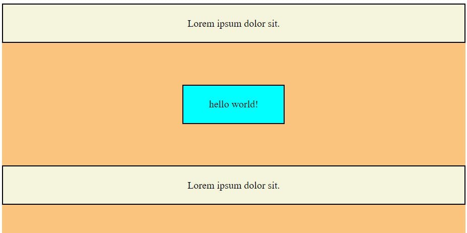
Using Display Inline Block:
This is the solution of the inline box because the inline box is take only content available space and any property given those are not apply vertically, so we use display : inline-flex; and apply vertically all property.
display: inline;Example:
    <style>
         p {
        background-color: beige;
        padding: 20px 40px;
        border: 2px solid black;
      }
      span {
        border: 2px solid black;
        background-color: aqua;
        padding: 20px 40px;
        margin: 50px 20px;
      }

      div {
        background-color: rgb(250, 196, 127);
        width: 95vw;
        height: 100vh;
        text-align: center;
        /* padding: 30px; */
      }
    </style>
Using display: inline-fex; and getting vertically functionality:
    <style>
         p {
        background-color: beige;
        padding: 20px 40px;
        border: 2px solid black;
      }
      span {
        border: 2px solid black;
        background-color: aqua;
        padding: 20px 40px;
        margin: 50px 20px;
      }

      div {
        background-color: rgb(250, 196, 127);
        width: 95vw;
        height: 100vh;
        text-align: center;
        /* padding: 30px; */
      }
    </style>
Thanks for reading blog if you want read in more depth so you go with mdn docs.


