Media query is use for different screen devices for giving different functionality. Devises width are many type like as mobile, tab, laptop, large screen devises etc, we targeting these all devices using media query and we set the website content according to the device width by media query.
Syntax:
@media ()We can link the media by
<link>,<style>and<source>. Media query have three typeall,print,screenand we use these types with logical operatorsnot,onlyandand. Not operator reverse the meaning.Media features describe a specific characteristic of the user agent, output device, or environment:
any-hover, any-pointer, aspect-ratio, color, color-gamut, color-index, device-aspect-ratio Deprecated, device-height Deprecated, device-width Deprecated, display-mode, dynamic-range, forced-colors, grid, height, hover, inverted-colors, monochrome, orientation, overflow-block, overflow-inline, pointer, prefers-color-scheme, prefers-contrast, prefers-reduced-motion, resolution, scripting, update, video-dynamic-range, width.
Media Types:
print:
Here we use media for applying condition on printing. When you give print any document then what should the color of font when you get printout.
- Syntax:
@media print {
  /* … */
}
- You can also target multiple device like screen and print. This
@mediarule target both media together.
@media screen, print {
  /* … */
}
screen:
When we targeting only on screen then we use @media screen and target them device width and all changes show on only screen because we targeting screen.
- Syntax:
@media screen {
  /* … */
}
- Note:- When we want to target all devices then we write
allkeyword, if we not write any thing after@mediait's take the all device automatically.
@media all {
  /* … */
}
@media  {
  /* … */
}
above code both are equal.
Combining all types and features:
When we want use media in more complex then we use all types, logical operator and with features together.
@media (min-width:500px) and and (orientation: landscape) {
  /* … */
}
@media screen and (min-width:500px) and and (orientation: landscape) {
  /* … */
}
- Example:
<!DOCTYPE html>
<html lang="en">
  <head>
    <meta charset="UTF-8" />
    <meta http-equiv="X-UA-Compatible" content="IE=edge" />
    <meta name="viewport" content="width=device-width, initial-scale=1.0" />
    <title>Media Query</title>

    <style>
      .parent {
        background-color: aquamarine;
        width: 1200px;
        height: 700px;
      }

      .media {
        width: 150px;
        height: 150px;
        color: white;
        text-align: center;
        margin: 15px;
        font-size: 30px;
      }
      .media1 {
        background-color: rgb(86, 118, 55);
      }
      .media2 {
        background-color: rgb(86, 118, 55);
      }
      .media3 {
        background-color: rgb(86, 118, 55);
      }

      @media screen and (max-width: 900px) {
        .parent {
          display: flex;
          justify-content: center;
          align-items: center;
          background-color: rgb(152, 151, 151);
        }

        .media {
          border: 4px solid black;
          border-radius: 50%;
        }

        .media1 {
          background-color: rgb(11, 240, 221);
        }
        .media2 {
          background-color: rgb(239, 255, 67);
        }
        .media3 {
          background-color: rgb(86, 118, 55);
        }
      }
    </style>
  </head>
  <body>
    <div class="parent">
      <div class="media media1">one</div>
      <div class="media media2">two</div>
      <div class="media media3">three</div>
    </div>
  </body>
</html>
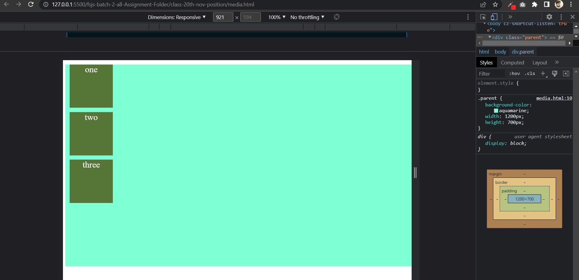
Normal Output: means when media is not apply above 900px value then output is these type:

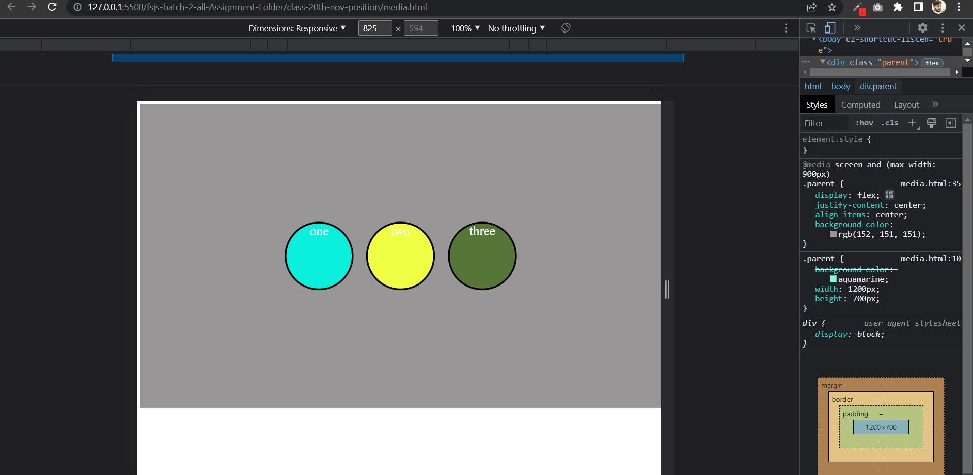
Normal Output: When media query is apply on 900px or less than 900px then the output is:

Using not keyword:
This is the invert of the whole media meaning if apply not keyword.
@media not all and (max-width:400px){
/*   */
}
This means that the above query is evaluated like this:
@media not (all and (max-width:400px)){
/*   */
}
It wouldn't be evaluated like this:
@media (not all) and (max-width:400px){
/*   */
}
If you want read in deep then go with mdn docs. link is here: media query mdn
